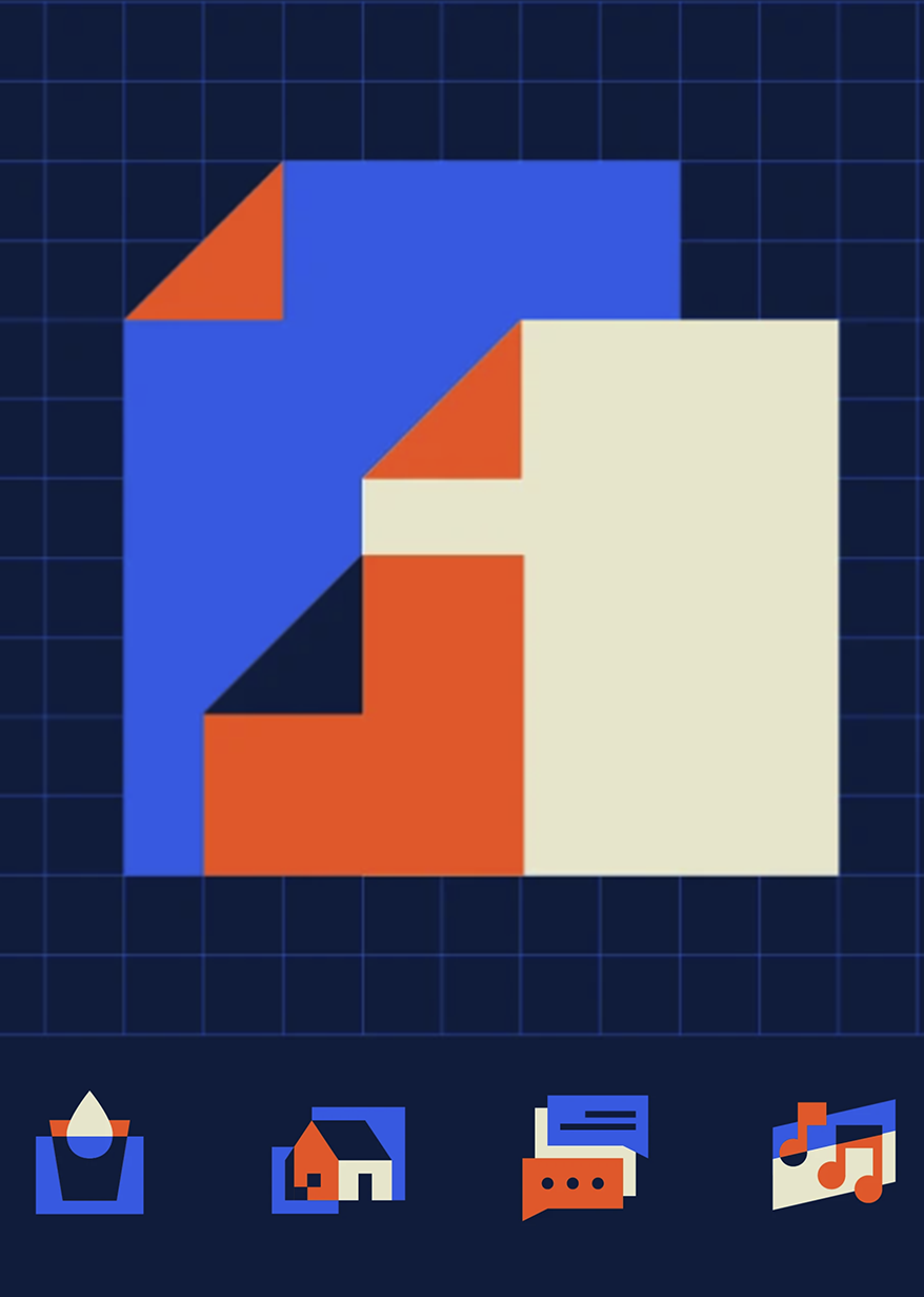
Icons are the universal language of digital interfaces. I design comprehensive icon systems that remain recognizable at any size, work across platforms, and maintain visual consistency while serving diverse functional needs—from navigation to data visualization.
Organizations accumulate icons from multiple sources—stock libraries, designer contributions, one-off creations—resulting in visual inconsistency that confuses users and dilutes brand identity. Icons must work at 16px while remaining clear, distinctive, and instantly recognizable.
- Create cohesive icon families with consistent visual language across hundreds of symbols.
- Design for multiple contexts—product interfaces, marketing materials, data dashboards.
- Ensure accessibility for color-blind users and compatibility with screen readers.
Icon design requires balancing artistic expression with mathematical precision. I established systematic design principles—grid systems, stroke weights, corner radii—that ensure visual harmony across the entire set.
- Audited existing icon usage to identify gaps and inconsistencies in current systems.
- Developed design principles defining stroke weight (2px standard), corner radius (2px), and optical adjustments.
- Created modular icon components allowing rapid generation of consistent variants.
- Built comprehensive libraries organized by category (navigation, actions, objects, status).
- Established naming conventions and metadata tagging for easy searchability.
- Designed both outline and filled variants for different UI contexts.
Beautiful icons must also perform flawlessly across platforms and sizes.
- Optimized SVG code removing unnecessary paths and reducing file sizes by 40-60%.
- Designed on pixel grid ensuring crisp rendering at small sizes (16px, 20px, 24px).
- Created accessible implementations with proper ARIA labels and semantic markup.
- Provided multiple export formats (SVG, PNG, icon fonts) for different use cases.
- Built automated testing to verify visual consistency and technical quality.
- Documented usage guidelines including when to use outline vs. filled variants.
Icons don't exist in isolation—they're part of larger design systems that require careful integration.
- Defined icon sizing scale matching typography and spacing systems.
- Established color usage rules for different icon states (default, hover, disabled).
- Created component libraries for React, Vue, and Angular with proper TypeScript types.
- Documented accessibility requirements including minimum touch targets and color contrast.